kitchen update with my sister
Good morning! I’ve got a special post for you today, because my sister is sharing her recent kitchen update with us!
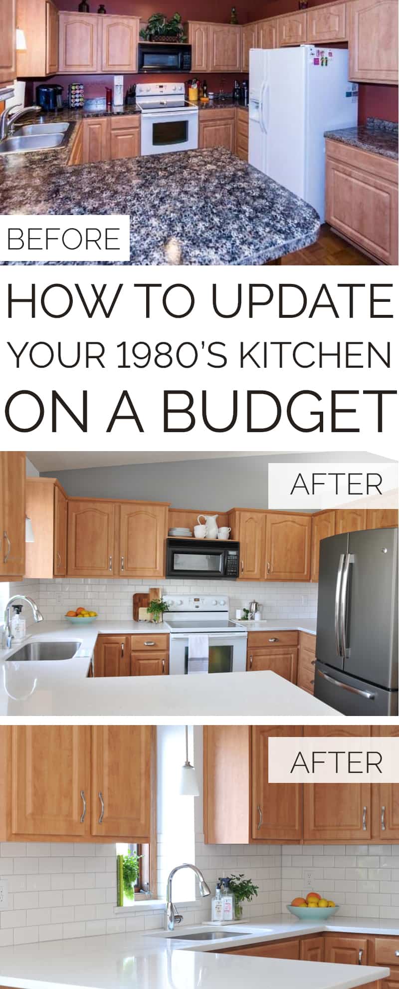
Sarah started with a typical 1980’s kitchen (with a rather overwhelming color scheme!), but she totally transformed it by making some key updates. It all looks pretty fantastic in my opinion! I love how fresh and open her kitchen feels now; something that can be a real challenge to achieve when you’re working with a standard 1980’s split-level home. Her goal was to make the biggest impact with the least amount of money, and I think a lot of us can relate to that, so keep reading for some great inspiration and ideas for your own kitchen update.
You can find more from Sarah over on her Instagram where she talks about interior design, homemaking, and all things creative.
Alright Sarah, take it away!
I went into our house-search swearing up and down that I would NEVER end up with an 80’s split-level. Well, here I am two years later in an 80’s split. It’s always hard to picture what a space could become, and this kitchen was a doosey. Let’s start with some before photos (from the sellers listing):
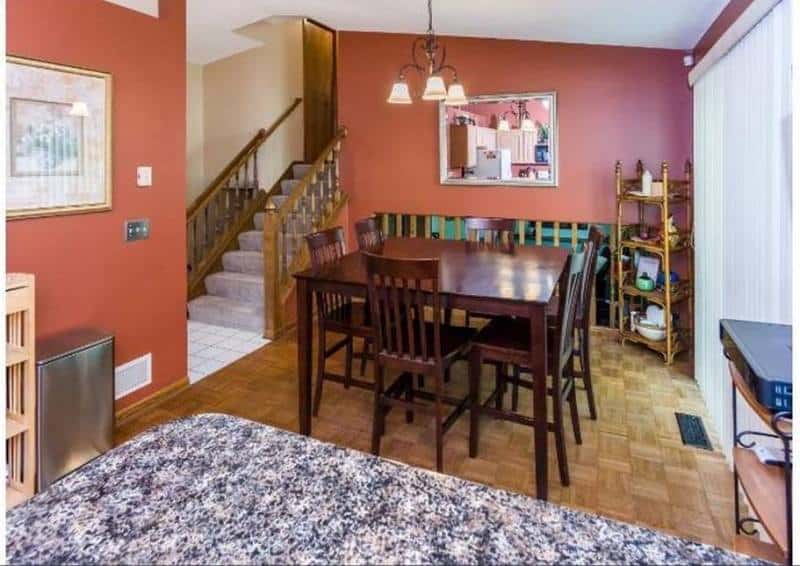
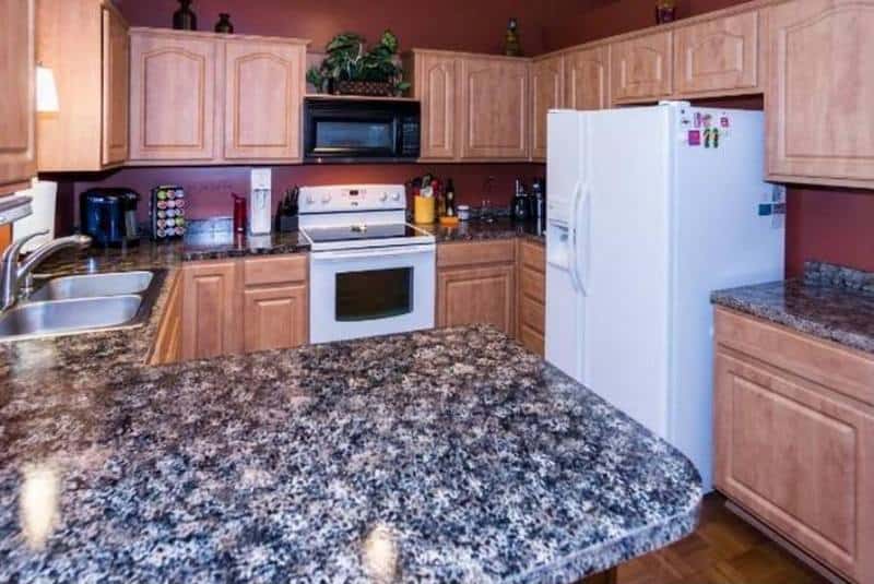
This red/orange color was all the rage in the 2000’s, but putting this all over the semi-open concept north end of the house (which already has very little natural light) darkened the whole space significantly.
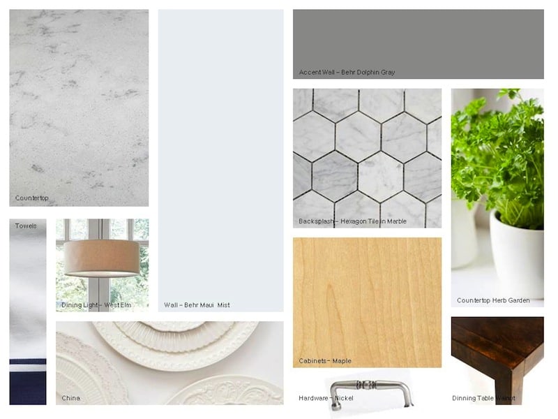
Right away I made a mood board to capture how I wanted this kitchen to look and feel. I work from home, and I wanted it to feel like a coffee shop, which would hopefully prevent me from spending all my money at Starbucks to get that coveted ambiance that makes me productive…at least until my venti iced Americano runs out.
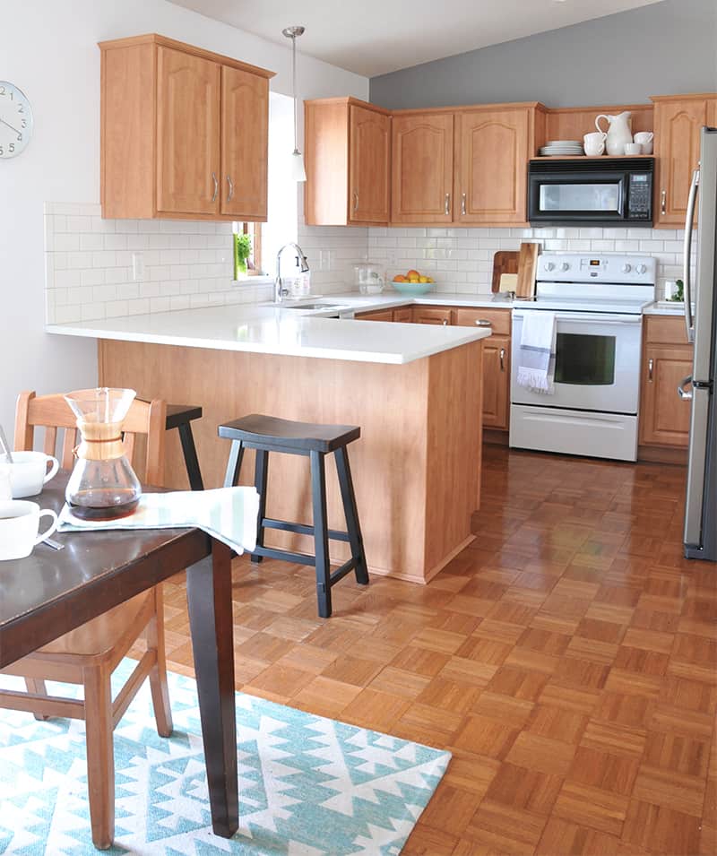
The first step was realizing that the cabinets (as much as I wanted to replace them) were in perfectly fine condition and quite expensive to replace.
However, sometimes encountering limitations like this is actually helpful to the design, because it helps to inform the remaining choices you have left. It narrows the options and makes an update slightly less overwhelming. So, if you have something in your kitchen that you absolutely cannot change, don’t despair, just make it work!
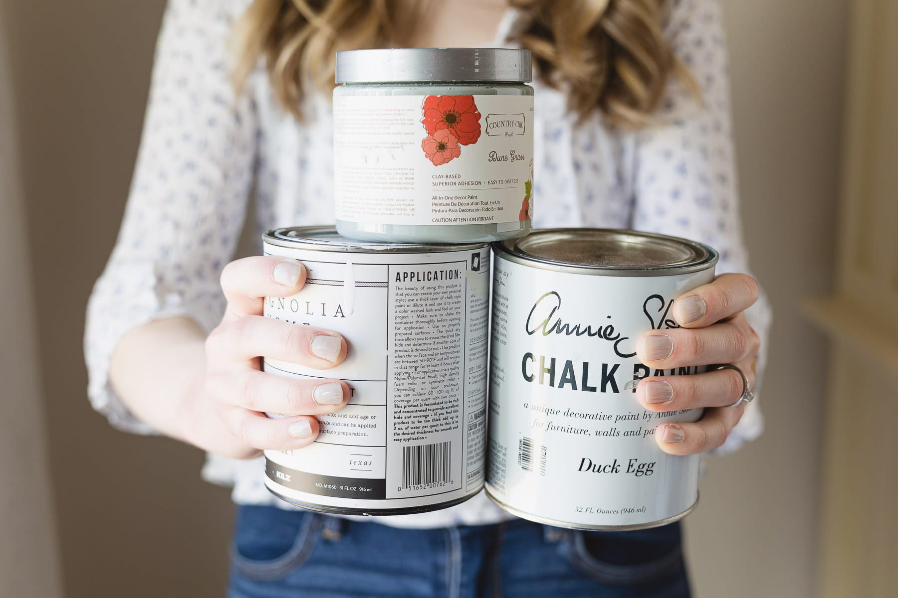
Choosing the paint color
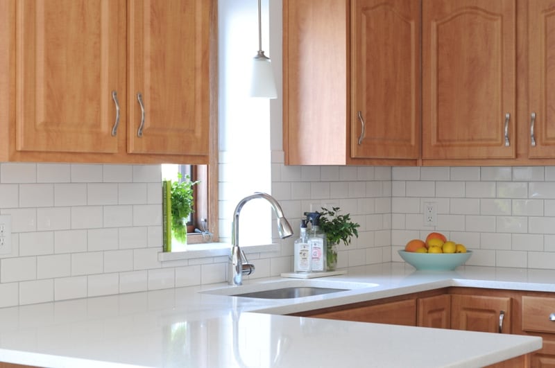
Since the cabinets have a yellow/orange undertone to them AND this side of the house only gets afternoon sun (which has an orange cast to it) picking a white paint with a yellow or orange undertone would make the paint look yellow. So, by picking cool tones to surround the warm cabinets it would off-set the orange. Gotta be honest, I was torn on what white to pick because there are SO MANY. And to add to the pressure, everyone and their mother is using “simply white” by Behr. But, as soon as I got the sample in the kitchen, it was yellow, and I mean YELLOW. After trying some other ideas, I ended up going with “Maui Mist” by Behr, which turned out to be a crisp white in our home lighting, even though it looked a little blue at the home improvement store.
I love how it reflects the afternoon sun and really diffuses that orange light. So, if you’re struggling with what shade of white, pick the white that works for you and your space! Not the white that everyone on Instagram is using! Ok, getting off the soapbox now…ahem.
Counter tops
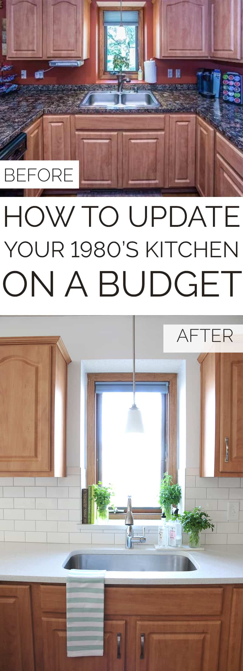
Let’s take a closer look at the counter tops. The previous owners sponge-painted them to look like granite. And it was all a bit of a mess unfortunately. The top layer of formica had become unglued from the plywood core, the finish on the paint was oddly tacky (think wet nailpolish), and the overall color scheme darkened the kitchen a lot. Because of the peeling formica and the questionably sticky surface, we knew this was an area we needed to invest in.
We were initially thinking of replacing the counters with a higher quality laminate product…until we found out it was going to be just a few dollars more per square foot to get stone. Yes, please! We went with a “sparkling white” quartz countertop. This has a blue/cool undertone and flecks of blue in it, so it coordinated perfectly with my choice of white paint on the wall. If you are replacing your countertops I would highly recommend replacing your sink at the same time. I really wanted a porcelain farmhouse style sink, but with a price tag of over a thousand dollars on the low end, it just wasn’t in the budget. Plus it would be even more pricey to install because it would require cabinet modification. So, instead I went with a single-well stainless sink and new faucet, and can I just say, this sink is ahhhhhmazing. And at a whopping $200, I was SOLD. SOLD I tell you.
Backsplash
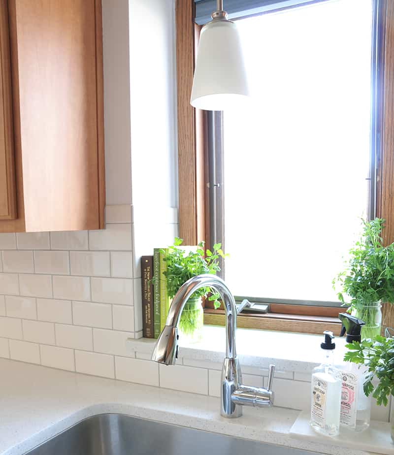
For the backsplash, I really wanted a hex pattern, but since we are planning on (eventually) selling this house, I didn’t want one more thing to that could go out of style in the next five years, so we opted for simple white 3×6 subway tile. The white is a tad warmer than I wanted, but the other option for backsplash was a blue glass, and I preferred to go with something color-neutral for resale. Another factor was cost. Going with a blue glass would make the backsplash twice as expensive as the countertop. Yikes. So, to help coordinate I went with a cool-tone grout to pull in the flecks of gray in the countertop. Just goes to show, sometimes the moodboard doesn’t always get followed to a T. And that’s OK! The mood board is there for a general feel and ambiance, and you can always change your mind!
Appliances
Let’s talk appliances. These were not in the scope of this project, but the fridge literally died, so I got to replace it. Then, the dishwasher had this odd burning smell, so THAT had to go (it was over 25 years old, so it was time). Now I’m just waiting for that awful black microwave to die.
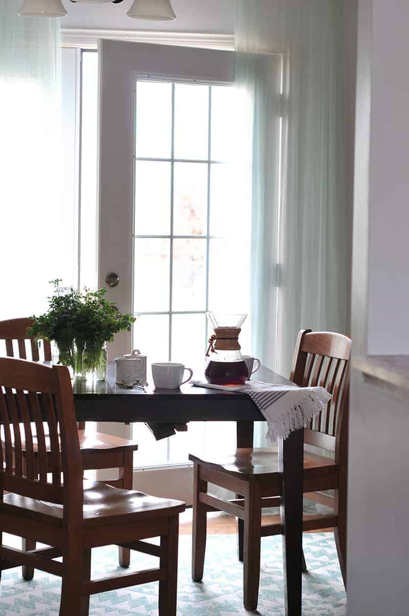
Dining area
Now to the “eat-in” part of the kitchen. As soon as we saw the house I knew I wanted French doors to replace the slider, and I got my wish! Thanks to some extensive wood rot on the bottom of the sliding door, we went ahead and updated to these pretty white doors. They give the whole space a bright and airy feel that I love!
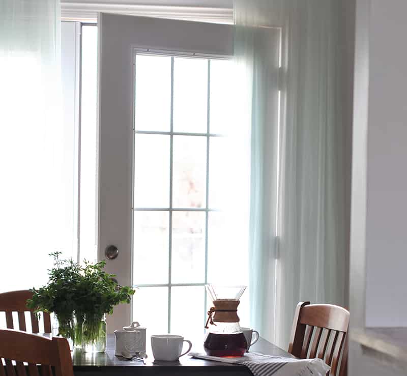
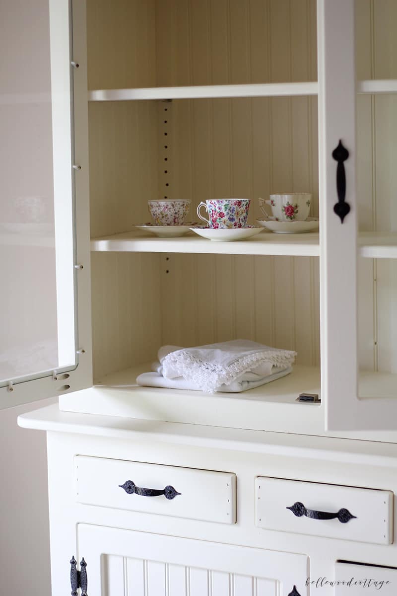
Tip: Fresh herbs are a wonderful touch of green that is more affordable than fresh flowers. I usually get cilantro and parsley from the grocery store in the winter for a few dollars, and I use these all the time when I cook. Dual purpose, always a good thing.
Finished results
So, I am really happy with the kitchen result, and it’s always exciting to see a vision come together even in the face of overwhelming paint colors and stylistic elements. If you are tackling your own kitchen update, I really suggest first making a mood board and a detailed budget before diving into the project. Figure out the key components you need to invest in to make the greatest overall change to the space and start with those. And never forget the power of paint!
So, that’s the story of the kitchen thus far! If you have any questions feel free to comment below, or reach out on Instagram, I’d love to hear from you!
xo Sarah